Portfolio Website
CareerFoundry Case Study
Overview
Not having a portfolio site made applying to entry-level UX design positions incredibly difficult, so I decided to create one from scratch! Coding my portfolio website allowed me to better understand how designs are translated into code. This experience built a vocabulary and nascent understanding that allowed me to empathize better with development teams and be more mindful of the feasibility of my designs.
"60% of participants said ‘Yes,’ they would reach out for an interview."
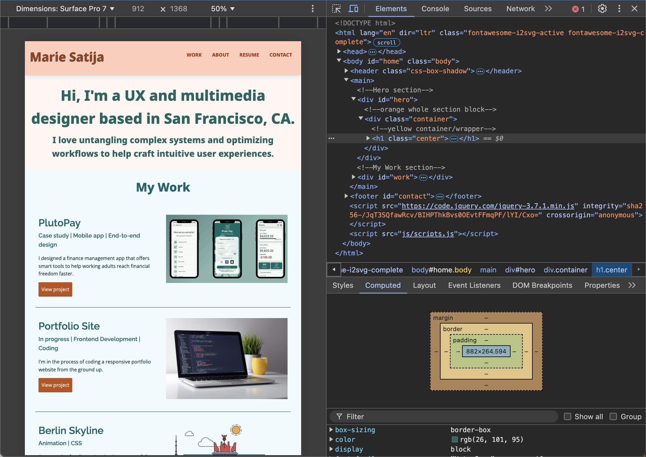
Project: Responsive portfolio website
Role: UX Design, Front-end development
Tools: Figma, Github, VSCode
Languages: HTML, CSS, JavaScript
The Problem
Non-existent portfolio website.
An insufficient number of case studies.
I finished an online UX Design course and started to apply for jobs. All applications required a link to a portfolio website. Being new to the industry, I didn’t have this yet. Even if I did have a portfolio site, I lacked a sufficient number of projects to showcase on it.
The Solution
Design & develop portfolio website from scratch.
My design course offered an additional class called “Front-end Development for Designers.” I saw this as the perfect opportunity to build a portfolio site and use the process of developing it as an additional case study.
Research
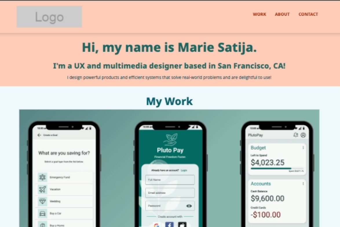
Hero statements quickly introduce yourself.
Work sections are used to highlight past projects.
About sections help inject humanity and personality.
Minimalist design plus hero-sized images help focus attention on the work itself.
Contextual text helps to understand a project before needing to click into it.
I’ve never had a portfolio website before, so my first step before creating my own was to research what was already out there. I wanted to see what similarities exist between portfolios for visual art, software design, and data-driven projects. So, I searched for portfolios from graphic designers, animators, UX designers, and data analysts. There were obvious similarities, such as “Work” and “About” tabs, but also similarities that helped the best portfolios stand out, such as intro statements, hero-sized images, and contextual text summarizing projects

Define
Keep the visual design simple & follow pre-determined wireframes.
Choose optimistic colors & professional typography.
Goal: Functional site with core features.
After researching what the best portfolios had in common, I started to dream what my “perfect” portfolio would look like. Bold colors, funky text, fun interactive components, beautiful imagery, but then I realized that I might’ve put the cart before the horse.
Taking a quick look ahead at the course curriculum, I realized that most of the coding guides were built around a pre-determined set of wireframes. Also, having zero coding background, I thought it best to keep things simple for the first iteration of my portfolio site. The most important goal was to have a functional portfolio site with the most crucial features, not necessarily the coolest.
Typography
Clean, readable, professional.
Google Fonts for cross-browser compatibility.

I loved the funky typography in other portfolios, but I was worried that if I went too funky, it might connote a particular industry or product type that I’m best suited for. Right now, I don’t want to lock myself into these types of assumptions. Instead, I preferred to be as versatile as possible, opting for clean, professional typography. I also made sure to choose typography from Google Fonts because of their extensive web-safe library of fonts and compatibility across multiple browsers.
Color
Optimistic, approachable, down to earth.
Orange + blue/green = calm optimism.

My favorite color is a deep purple, but this tends to be associated more with luxury. As a person, I’m more of a happy-go-lucky, down-to-earth gal, so I wanted to choose colors that matched closer to this. I landed on shades of orange and deep blue/green to help connote calm optimism.
Development
Follow a mobile-first design approach.
Implement HTML, CSS, and JS.
Optimize photo size for various screen breaks.

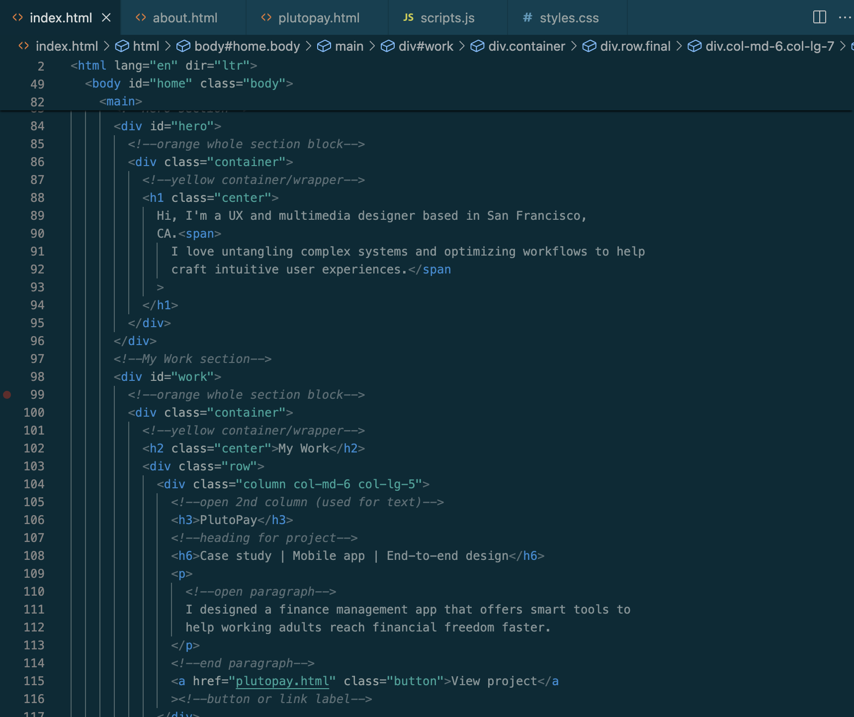
Once I had the wireframes and styles set, It was time to bring my portfolio site to life. I followed a mobile-first design approach and closely followed coding guidelines and best practices, starting with HTML to bring in my content in its most basic linear form, and then adding on CSS to give the content form and style. Lastly, I integrated Javascript to add menu interactivity in the mobile version of the site

Test
With the first iteration of the website in hand, I began testing it with friends who currently work in the tech industry and adjacent fields. I wanted to see how well the site functioned and how likely a hiring manager would contact a candidate with this portfolio.
Target users:
30-40 years, white-collar professionals in the tech industry.
Testing goals:
Evaluate the effectiveness and usability of the portfolio site. Including ease of navigation, clarity, & visual appeal.
Key Findings:
Aside from some errors, the site functions as expected.
Users can find most of the information they are seeking.
60% of participants said “Yes,” they would reach out to this candidate for an interview.
Critical Errors:
Images are too large for laptop view.
“Download resume” button is difficult to locate.
Error in menu behavior when “contact” is clicked.

Critical Updates:
Debug code to ensure proper functionality of all menu items.
Optimize image sizes throughout the site, especially for larger screen breaks.
Increase text size in the hero section for better readability.
Update the color of the button hover state to follow web accessibility guidelines.
Add a direct link to resume in the navigation menu.


Deliver
After making critical updates to my portfolio, It was time for me to launch it to the wider world. In order to do this, I utilized various code linters to check for any inconsistencies in my code, as well as test the site across multiple browsers such as Chrome, Firefox, Safari, and Edge. Finally, I used GitHub pages to host my portfolio.


Final Portfolio
You can check out the final portfolio website here → Marie’s Portfolio Website


Challenges & Learnings
Testing the first iteration of my portfolio site was incredibly difficult. I already knew the site wouldn’t look like the portfolio of my dreams, but it was still hard to show it to others in such a visually underdeveloped state. It was a greate exercise in humility as well as practicing “done is better than perfect.” Testing early and often is the only way to get a product to an effective and desired state.
Coding is hard! But I loved getting to peak behind the curtain of development. I’ve definitely gained valuable insight into how things work and the feasibility of designs. It also helped build a large well of empathy for engineering/development teams.
Lastly, while testing the site with experienced hiring managers, I learned that coding isn’t something that is often expected from UX designers. This is encouraging, since the task of updating my portfolio’s visual style through code seems pretty daunting at my current coding level. I do still plan to learn more coding– I love the puzzle of it– but for now, I can focus my efforts on effective, usable, and feasible designs.