
PlutoPay
CareerFoundry Case Study
UX Case Study
PlutoPay is an AI-integrated finance management app that offers smart tools to help working adults reach financial freedom faster.
The mission is to alleviate the inequality of an ever-widening wealth gap by empowering everyday people to thrive, not just survive.

Context for the Problem
Economic inequality is rampant in the U.S. today and can easily be seen by the everwidening wealth gap. The bottom 90% of Americans only own 32% of U.S. wealth, according to the Federal Reserve. These numbers were exacerbated by the 2020 pandemic and the numerous financial hardships that still face Americans in the years that have since followed.
Lots of working-class Americans simply want to achieve financial stability and the freedom that comes with it. But…
"Money is complicated."
Well, I don't think it has to be. I believe that better finance solutions can help alleviate some of the undue complications that everyday Americans face while navigating their finances. Pluto Pay is my design solution to this problem.
The Design Process
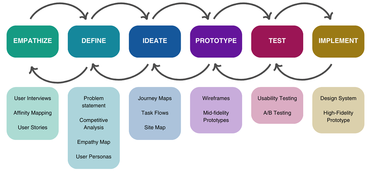
Empathize with users
I conducted remote user interviews with 23-35yr old working adults with a high debt-to-income ratio who struggled to meet their financial goals.
Interview Goals:
Explore opinions and feelings around money.
Understand current mental models for spending, saving, managing, and investing.
Discuss existing tools and points of frustration.
Observed Issues:
Low levels of financial literacy & understanding of technical terms.
Not enough time to dedicate to in-depth formal learning.
Difficulty keeping track of spending.
Multiple types of accounts across different institutions.
An inability to save consistently towards financial goals.
irregular review of finances and consistently going over budget, especially for emergencies.
All interviewees had a fairly good idea of what they should be doing in order to reach financial stability, but income and time seemed to be the biggest factors in why they hadn't reached their financial goals yet. Although most interviewees knew generally what they should be doing, there was still a belief that money is too complicated. Some participants even bought books and listened to money podcasts, but their interest waned dramatically since there was "so much to know."
The interviews were helpful for me to understand that "more money" isn't necessarily the goal for people, but a life of security, safety, and independence was far more important than just being able to buy things. The interviews also helped me to know what features people prefer to use when managing their money and the importance people place on simplicity.
Define user needs and problems
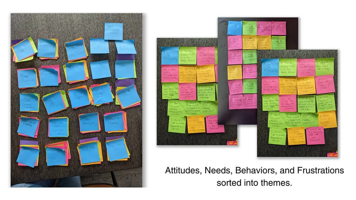
Further analysis of user statements revealed not only their difficulties but also their desires. This helped to develop target-user attributes and insights that would inspire key features of PlutoPay.
Problem Statement:
“Struggling adults need a way to reach financial stability so that they can afford a lifestyle that matches their desired identity.”
Target Users:
Working-class adults, ages 23-35, with a debt-to-income ratio above 35%.
Adults who are seeking freedom, comfort, & confidence with their finances.
New investors seeking to grow wealth and understand finance strategies.
Individuals in need of expense management to maintain or achieve their preferred lifestyle.
Once I understood the behaviors, pain points, and goals of real people, I began to see three distinct target users take shape. I created design personas to better understand what each user found most important as well as a way to empathize with my potential users throughout the entire design process.
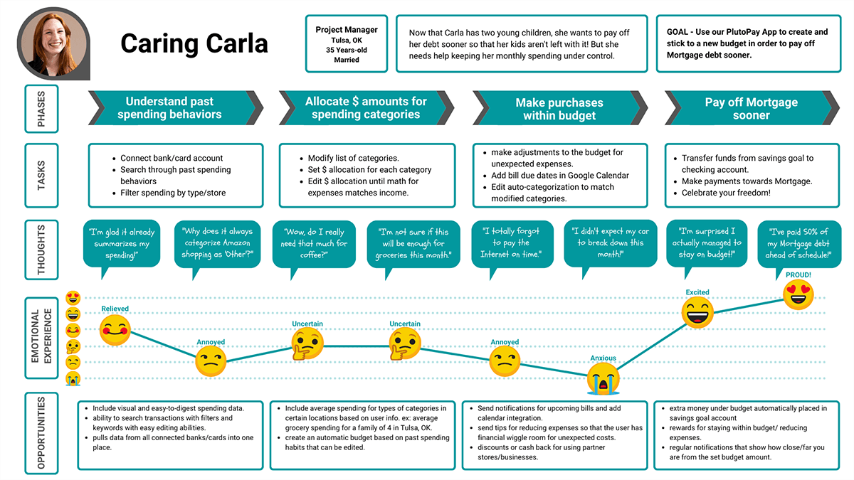
Caring Carla is the main financial planner for her family but has trouble managing multiple accounts, bills, and goals. She wants to spend more time with her family, and less time worrying about balancing the budget with enough surplus to reach her family goals.

Next, I put myself in their shoes and created journey maps for each persona. This helped me to understand how they might feel while trying to complete some of their goals within our app. This allowed me to find potential issues before they become a pain point for real users as well as begin thinking about the feature opportunities for PlutoPay.
Caring Carla would benefit from features that offer:
Personalized budget based on past spending habits that can be edited.
Robust tools that help visualize spending from multiple accounts all in one place.
Automatic contributions to her savings goals based on her spending.
Ideate possible solutions
The analysis and exploration of possible solutions for target users and current existing app solutions revealed both the minimum features necessary to compete as well as competitive opportunities for features that would best benefit my target users. This resulted in my first design hypothesis for a possible solution.
Competitors: Mint (M), Google Pay (G), Paypal (P), Venmo (V)
App Basic Features:
Multiple account balances. (M)(G)
Peer-to-peer money transfer. (G)(P)(V)
Digital wallet. (G)(P)(V)
Basic budget/spending insights. (M)(G)
App Competitive Opportunities:
Interactive, AI-integrated tools for money management and spending insights.
Goal creation tools and automation for saving/investing.
Educational portal focused on strengthening financial literacy.
Incentives that reward healthy financial habits.
A Possible Solution: Automate, Educate, Manage
Create an app that speeds up savings through automation, education, and management tools that help users build long-term financial health while meeting their most basic transaction requirements.
Building a Blueprint
Based on the unique opportunities for my personas, I defined key objectives and built user flows to help me visualize the logical paths that best accommodate my users while also revealing essential pages, features, and functions needed in order to complete the tasks.
I then built a preliminary sitemap and organized the pages/screens by using a hybrid of flat and hierarchical structures in order to preserve simplicity within the app's navigation.
I refined the sitemap by analyzing data from an open card sorting exercise where participants organized 30 features/tasks into groups and labeled their groups. I wanted PlutoPay to closely follow existing mental models for basic finance management and this exercise helped me to understand what features users often grouped together and how they might refer to them.

Foundational Pages/Features
Home - dashboard with most common budgeting, accounting, and payment tools.
Grow* - automation and tracking of goals and investments.
Learn - educational content to assess and build financial well-being and literacy.
Rewards* - robust incentive system that rewards healthy financial habits.
"Rewards" was initially labeled "achievements" and nested under the profile tab as a way to access all deals and rewards unlocked or achieved by the user through app usage and learning. However further research showed that Profile tabs are usually separate from the navigation bar pages. In most of the competitor apps, both Profile and Notifications were often found in the upper right corner, set apart from the main navigation menu. I decided to follow this convention so that PlutoPay would be easy to navigate for new users. Since "Rewards" is a major feature, however, I removed it from being nested under the profile section and gave it its own main page on the navigation bar as a foundational page.
I also renamed "Goals" to "Grow" because it encompasses multiple ways to grow wealth, including investments, not just contributions to goals. Grow also connotes a healthy and steady increase and matches the leaf logo of PlutoPay.
Prototype a solution
During the prototype phase, I made an interactive mid-fidelity prototype of the foundational pages and most common management tools. Major decisions from this process are as follows:
Bottom navigation showcasing 4 high-level sections of the app to highlight each having equal importance.
Primary pages include overview cards that open up to secondary pages housing section-specific information and details. Important summary information can be found on the card itself, for easy at-a-glace digestion of key financial information.
Profile & Notifications are separate from the main navigation menu.

Ideate possible solutions
PlutoPay's prototype offers financial tools that help users increase financial literacy by helping to track their spending and encourage regular saving. With this prototype, I wanted to validate PlutoPay's usability and usefulness. I conducted in-person moderated user testing to answer the following:
Research Question:
"Can first-time users easily navigate the mobile app and do they find value in the finance tools provided?"
Testing Goals:
How clear are the progressive onboarding instructions for new users?
How intuitive is the app's navigation?
Where are there still points of friction within each task?
What is essential to the app that has yet to be incorporated?
Methodology:
Six adult participants, 23-35 years old.
Moderated, In-Person.
Three scenarios with relevant tasks to complete.
Debrief and survey following task completion.
After testing concluded, I reviewed notes and recordings of each session and separated notes into observations of how users think, what they feel, and how they interact with the prototype. I also noted specific errors users made and rated them based on the Jakob Nielson scale and color-coded based on participant.

Common Errors:
Missed the toggle for "Auto Contributions."
Didn't understand the lock mechanism when modifying the budget.
Misinterpreted total goal for monthly contribution amount.
Key Insights
Avoid cognitive overload by breaking longer tasks into multiple separate steps.
Re-align flows to better match users' existing mental models, especially for goal creation.
Users found the budgeting and goal creation tools useful but needed more clarity to complete the tasks.
Provide clarity by adding tutorials for unfamiliar features.
Implement changes based on feedback

After testing PlutoPay's usability through a mid-fidelity prototype, I updated the app to better reflect user mental models and provide additional clarity for more unfamiliar features.
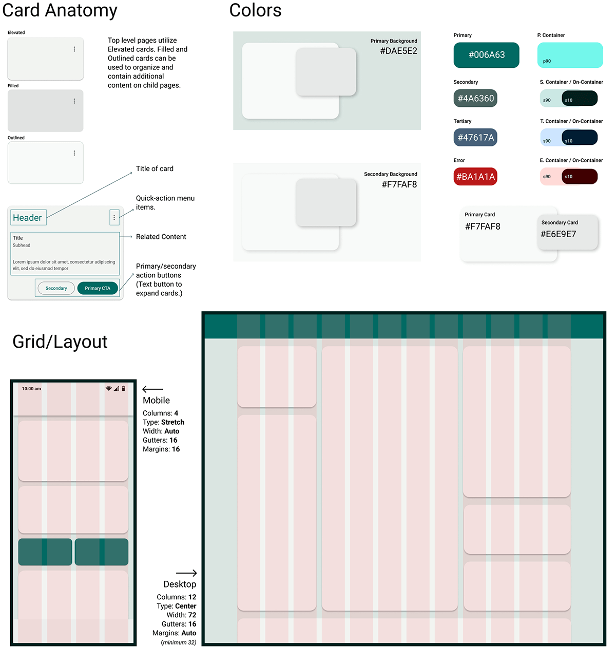
Afterward, I explored emotional design strategies and solutions using UI fundamentals to build a cohesive experience across the updated prototype. I used Gestalt principles of design, Google's Material Design 3 framework conventions, and peer feedback to refine PlutoPay's design into a unified visual language, ready for developer handoff.
I focused on the effect of color palettes, typography, and graphic elements on the user experience. As well as standardization of elements in order to facilitate a smooth hand-off to the development team. Consistency and a well-branded design will help gain the trust of our target users who will need to share lots of sensitive financial data with the app.
Visual language objectives:
Inspire security, trust, honesty, and reliability while remaining fresh and optimistic.
Every interaction with PlutoPay feels friendly and approachable.
Managing finances is as easy as chatting with a knowledgeable friend.
User success is our success and PlutoPay is here to empower users every step of the way.
PlutoPay's visual language includes:
Friendly, approachable language.
Deep shades of blue/green with aqua accents.
Font: Roboto - Regular, Medium, Bold.
Simple icons in Rounded & Outlined styles.
Google's Material Design 3 Framework(M3)-inspired components.
4pt grid system
Accessible color contrast and tap targets.
Iterative designs
Low, mid, & high, Oh-my!
Using the style guide, I created a high-fidelity version of the app and then asked for feedback from my peers. This helped to refine the design even further and uncover any inconsistencies or friction in the visual design.
Common Feedback:
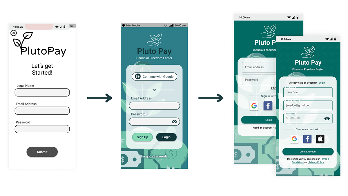
Need additional sign-in options & clarity between Sign-up/Login.
Reduce overcrowding of information within cards.
Re-organize the budgeting tool to better match users' existing mental models.

By implementing the following changes, I've polished the design of PlutoPay's fundamental features and set the stage for further development.
Key Changes:
Split “Sign-Up” and “Login” into two separate screens.
Limited supporting text on cards to 2 lines.
Adjusted font size and padding within action buttons.
Modified Budget flow to be shorter and include custom category option earlier.
Refined consistency with card Icons.
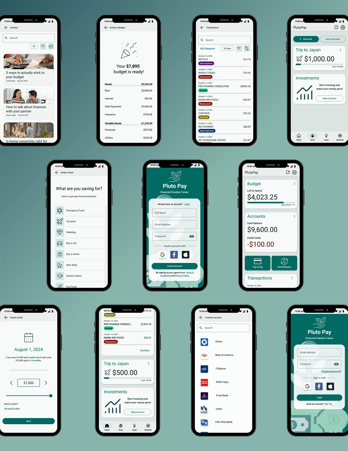
Additional Screens
What's Next?
Prototype and test additional features.
Expand style guide and pattern library.
Explore design patterns for iOS.
Now that the first iteration of a design language and high-fidelity prototypes are set, I would like to add additional features and test their usability with users. Most of the flows in the current prototype address features that are necessary simply to compete with other finance management apps. But I'd like to test some of the features that I believe will set PlutoPay apart from the competition, such as Round-ups, Financial health assessment, and Reward incentives. In addition to designing and testing these features, It is also important to start designing the visual language of PlutoPay for iOS users, since the Android conventions will likely not translate well.
Conclusion
Many Americans want to reach financial stability and the freedom that comes with it but struggling adults are often discouraged by their slow progress and lack of financial literacy. Managing their finances can seem overwhelming and complicated. In order to alleviate this issue, I spent time researching, designing, and testing a financial management app.
My app, PlutoPay, speeds up savings through automation, education, and smart management tools that help users build long-term financial health and reach financial freedom faster.